Monday, October 6, 2014

It's a Boy! A Classic Baby Shower at it's Best!

     It's a boy! Three wonderful words for any soon-to-be parent to hear, don't you think? Well, the lucky parents-to-be in this case happen to be my oldest daughter's dance team coach and her husband.  Since we love to throw parties at our house, we hosted the team shower here.  Of course, I thought I'd better share some photos of the goodies I made with you all, both of the crafty and the sweet variety.

     Let's start with the crafty...as usual most items were designed with my PrintShop2 for Mac. I began where all good party planning does with the theme and invitation design. The mommy-to-be had already decided on a woodland critters theme for her nursery but was having another shower with this theme, so I found clip art from my collection of a vintage pen and ink drawing of a boy feeding a lamb to tie in with the animals but give it a different spin. You'll notice I added a tiny monogram of the baby-to-be's initials to the back of the collar.  Here's the finished product...minus the details...sorry, but can't be too careful these days! I printed them on blank card stock invitations (I've mentioned them before, I know!) purchased at Target. $9.99 for 50!

     If you've read my older posts, you know I like to make my own party decorations.  It just gives a party that really personalized feel, making the person you're throwing the party for feel extra-special! So, I started with a banner for the mantle. Now, I know you might be thinking...they're super trendy... but you must admit they look really cute in a room where the fireplace mantle is always the focal point.  Okay, so with that said, in keeping with my invite I used the same artwork and the always classy monogram.  (The monogram was created on my iPhone on a free app, then emailed to my computer for use.)  I like to actually stitch my paper banners on the sewing machine because, in my humble opinion, it looks better than tape or glue, and is much sturdier.  I use narrow double-fold seam binding instead of ribbon, it's cut on the bias so it drapes to a curve very easily.  In this case, I alternated my simple designs of the boy with lamb and the monogram. (Be sure it's an odd number of flags, it looks better people!) I finished it off with some tulle rosettes and a vintage covered button. The other decorations included a selection of vintage baby bootie vases with flowers, a squirrel figurine, topiaries and a small chair. Oh, and I forgot to pan down when photographing that I used a vintage baby crib to hold all the gifts! You'll just have to use your imagination, I guess.


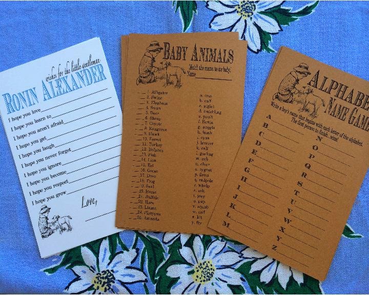
Of course, it wouldn't be a baby shower without games and prizes.  Staying with the animal theme we played a baby animal matching game (hilarious with a bunch of teenage girls), but we also played the traditional alphabet baby name game and 'how big is the mommy-to-be's belly' game.  In addition, I had seen some 'wishes for baby' cards on Pinterest and made my own version as a keepsake for the new family.  You'll notice all the game cards included to boy with lamb artwork.  Continuity is really important when creating a theme!


     Below are the prize bags, too! It's the first time I printed directly onto a small brown lunch sack.  Here's what I learned through trial and error...be sure the print on the side without the seam, feed the bag through top first, and fold down that top edge so it's not raw. Luckily, they're cheep so no big loss. Amazingly, I didn't even jam my printer! After printing, I folded a dessert paper (like a cupcake liner) over the top, hole punched through all layers and laced it with blue satin ribbon. (If you've never done this, just feed both ends of the ribbon through the front side of the project, pull and even ribbon, then feed the ribbon from the backside through the opposite hole back to the front, trim ribbon at an angle. Voila!)
 
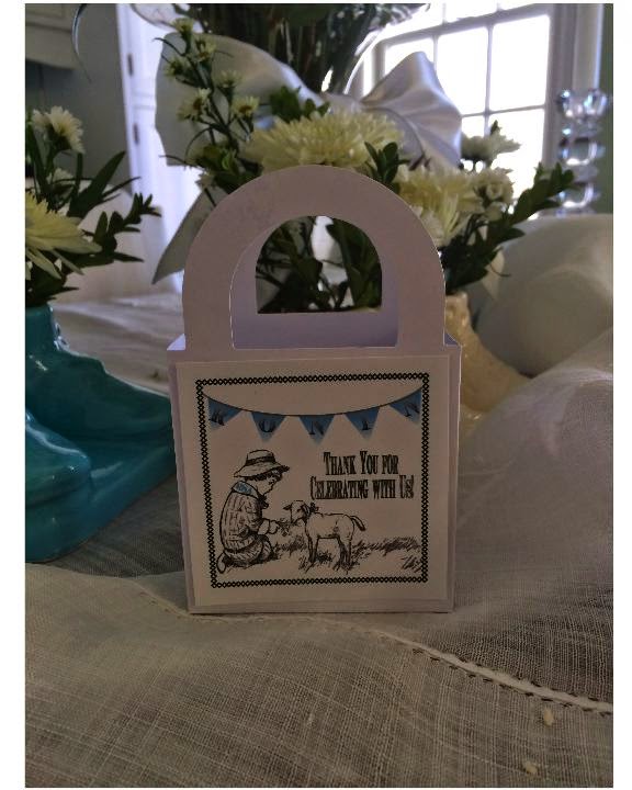
Lastly, I made some favors for the team to take with them...chocolate favors in blue and silver, of course! I've used these simple, white Dollar Tree boxes before and at 12 for $1 it's hard to beat the price. I use the label layout in PrintShop2 to print a whole sheet of images at a time onto card stock.  Once again, I repeated the use of the boy with lamb clipart on the favor tags and fastened them on with double stick tape. 


Now...onto the food! Our shower was held at 2 o'clock so we just served dessert. Blue desserts, to be precise. It's surprising how few blue foods there really are... well, maybe not so surprising. Anyway, I decided to give an ombre-colored cake a try. Very cute! I used store bought white cake mix, and be sure to use egg whites only when preparing it because it will give you the whitest batter. I used a 12" round, so it's one box per layer which made it easy to mix the colors in. But, if you're making a smaller cake you'll need to divide the batter.  I used a blue gel food coloring...15 drops for the darkest layer at the bottom, 8 drops for the middle layer and none in the top layer.  Don't panic if the color looks different on the outside when baked, mine looked a little green, (blue & yellow makes green, afterall) but once you slice into the cake it will be true blue. My filling was white chocolate buttercream (recipe on Food & Wine website), and cream cheese on the outside. Had I had more white chocolate I would have used it for the whole cake because it's so nice and white. But, if you do, remember to let it come to room temperature before serving because it hardens in the fridge unlike a regular buttercream. But oh, man...Yum!  The decoration is just simple blue and white piping with a medium round tip, a flat serrated tip and an open star tip. The little accent dots you see in the photo are actually edible pearl beads. I free handed the monogram, but you could use a toothpick to map it out before you pipe. I'm no professional, but I think it turned out pretty cute. And, much less expensive than a bakery cake! One tip...don't overmix your cake batter, just mix until incorporated! Over beating is what makes it have the dome in the middle that you then have to waste to even the layers.
The other goodies included white and blue swirl fudge, blue cream cheese brownies (just a few drops of blue food color into the cream cheese mixture), white and blue pretzels, French chocolate school-boy cookies (Lu brand), nuts and 'black' (almost blue) grapes. I like to display things at varied heights, and also incorporated a few classic childrens' books around the desserts.  It was all served on vintage ribbed-glass dessert sets. We had blue punch and coffee, as well.

Opps, I almost forgot!  My youngest also made some really cute little name tags for the soon-to-be Mommy and Grandma... unfortunately this is the best picture I have of it! Argh! I'll get better at this eventually ;)  She used that free monogram app, printed the image, laminated it, then glued it to some ribbon-embellished tulle. The whole thing was then glued to a clothes pin. So sweet!


Now all that's left to do is wait for this new baby's safe arrival! Can't wait!

Tuesday, September 9, 2014

Ciao Italia! An Italian Birthday...


Ciao! It was just birthday party time around here, and my youngest wanted an Italian-themed party this year...one problem...almost every major party supply store in our area has closed.  But, I decided to look on the bright side and see this as another opportunity to personalize the event using decorations we made together.  Major bonus! 

This project started with a quick trip my craft room to gather up what we had in the way of green, red and white supplies (the colors on the Italian flag).  Well, we had lots of white paper of course, so my daughter started by making some flags to decorate the top of her cake using some watercolor paint, skewers and glitter.  Lucky for us, the Italian flag is very easy to replicate! The photo above is of the finished project proudly displayed on her cake which was served on a pizza pan.  The decoration is all buttercream, even though it kind of looks like m&m's on the top.  My daughter just took a cake decorating class this summer with my mom where she learned how to do this frosting technique using a round tip (#12), and dragging it to one side with a offset spatula.  Simple, but effective.  Oh, and speaking of simple, look in the background of the cake photo and you'll see in place of some flowers, I cut some Italian parsley from our garden and put it into spaghetti sauce jars.


Next, came the invitations.  As mentioned in previous posts, I use PrintShop 2...a lot. So, my daughter and I sat down and came up with this design.  We downloaded the free clipart from the internet of the Leaning Tower of Pisa, and used the very cool font called "Draft Handwriting" for the large words.  The card stock is one of my go-to party items from Target, it's a box of 50 blank flat-panel cards (in other words, not a folded card) and 50 envelopes for only $9.99. The cards are 5"x8", and come in white and ivory. Such a deal!


Now, back to those DIY decorations...using some natural twine, Dollar Store streamers, and leftover Christmas tissue paper we made these cuties below for around the house...and, caped it all off with a personalized chalkboard in Italian for over the mantle with the evenings' menu! Antipasto trays, spaghetti and meatballs, Caesar salad, rustic bread, and our version of a cannoli cake (pound cake with mini chocolate chips) and ice-cream.  It was a great party, after all, you only turn 12 once! Ciao!


Thursday, July 10, 2014

Custom Cards for the Dancer in Your Life...

     The kids are still asleep, so I thought I'd travel back in time a bit and share some greeting card designs I made to sell at the dance team's gift table during the competition they hosted a couple months ago.  These cards literally sold out within a couple hours, so either I priced them too low ($1 each) or everyone just really liked them... I think I'll go with that!  So, as long as you have a computer, a printer, white glue, glitter and toothpicks you can make some too.  Here's what I did...
     
     First, I found some inexpensive small (4"x 5 1/2") blank cards on sale at JoAnn's in white, ivory and natural ($3.99 for 12). Then using my trusty PrintShop2 program (I've mentioned how much I like this program before, but it's really handy!), I designed very simple layouts that I could then embellish with fine glitter. I printed all the designs in black and white, and used mostly silhouettes or straight graphics of dance quotes for the card covers.  As I'm sure you can imagine, you can find lots of dance themed or inspirational quotes with a Google search but I also added some slang terms for the teens.  For an added touch, I put a little logo on the back on the card since it was a fundraiser thanking customers for their support. Once they were printed, I used white Elmer's glue and a toothpick to 'paint' the area I wanted glittered. I've got to say this was pretty darn fun, and since I have a fashion design background it really had my creative juices flowing on the dress form designs in particular.  You'll want to practice a bit first, but for the most part I just went for it! The tutus are especially fun, just use a dragging technique with the toothpick by picking up a blob (for lack of a better word) of glue and dragging it in an outward direction.  I also had some loose sequins around and glued those on to some of the cards, which looked pretty cool too. And, of course, a satin ribbon bow made the perfect finishing touch on some of the tutus!  When designing all the different costumes, I tried to incorporate common costume designs for different dance styles to reach a broad audience...and when you've been to as many competitions as I have, that shouldn't be hard! For a professional look and to protect the cards from fingerprints, I slipped each one into a cellophane bag, also purchased at JoAnn's.  
    Oh, and when our end-of-year dance banquet rolled around, I made cards for the coaches with my daughter's team state competition costume on them.  Which got me thinking, next year I can make a set for the whole team to wish them luck!  So here's a look at a selection of the finished product...hope you make some of your own! 


Monday, June 30, 2014

Dance Team Bag Tags!


     Well, it's summertime (Yay!) and around here that means sleep-away dance camp.  So, I decided to reinvent some bag tags I'd seen on Pinterest for my daughter's team to take along.  I began by playing around on my PrintShop2 program with some design ideas incorporating their school colors, school name and team name.  I must say, I love this program because it's very easy to operate, and if you're looking to do some graphic design work without spending a small fortune on software, it's a good fit for making invitations, favors, etc.  Anyway, I used the template for business cards because it fit my bag tag sleeves that I purchased at Office Depot (there are cheaper versions available online in bulk, but I didn't have time to wait for shipping!) Once I settled on a cover design, I printed some full sheets onto card stock and cut them apart.  For the reverse side of the tag I wanted to personalize them with each girl's name, but since PrintShop2 only allows a full sheet of the same design within the business card templates, I would cancel the print after two were printed and that worked great (Hint: Rotate the page to fit two sets on each sheet of paper...less waste!)  Now, I have one set of names for the bag tags and I have a full set of the girl's names to use for something else in the future.
     Each laminating machine probably works basically the same, so you'll just want to be sure to set your heat setting to the right millimeter thickness for your project. In my case, the luggage tag sleeves are 5 mil thick.  Be sure to heat your machine up completely, and to place the sleeve seam side to the bottom of the protective sleeve that comes with the tags (it's the end with the stitching across it.)  So, I sandwiched one each of the front design and one of the personalized name design, centered it in the bag tag sleeve, placed it in the protective sleeve and let the machine do the rest. 
     Now, onto the cutesy part! I purchased some inexpensive grosgrain and metallic ribbon and some mini-bells (after all, it's the team's name!) at JoAnn's.  I used some heavy buttonhole thread to sew mine together, but I'm sure a hot-glue gun would work too. To adhere the bow and charm to the tag, I attached the loop first (they are included) then sewed it through the whole and ribbon.  I just felt like it was a bit more secure than hot-glue, but that's up to you as the crafter! Oh, and if you're wondering why there's a candle in the assembly photo...that's because I like to melt the very end of my grosgrain ribbon to keep it from fraying. Be very careful, it can go wrong quickly and melt too much or worse catch fire, so move quickly! A lighter works too, but only do this step if you're an adult please!
     I'm not gonna lie, it took a good two hours to laminate, prep the ribbon and assemble 16 tags (it would be faster to glue than sew) but I think you'll agree they are worth it.  Too cute! Can't wait to give them to the girls at camp!


Friday, May 9, 2014

Go Team! Bleacher/Stadium Seat Cushion Up-cycle


     Am I the only dance team mom whose family walks away from day-long competitions with a sore bum? Doubt it!  Since I'm usually backstage, I wanted to make my family's fan experience more enjoyable by giving them some bum comfort!  So, to continue on my up-cycle theme from my last post, I made over these mildewy old seat cushions from 2007 we had stored in the barn into darling seat-saving beauties!  Here's how I did it...the photos are in order of assembly, so be sure to follow along!


     I started by disassembling the old seat cushions using a seam ripper. I wanted to use the old covers as my pattern, and the zipper, foam insert and handles were still in good shape.  Of course, if you're starting with all new materials you'll need to do some shopping.  You'll need a foam insert, 14" zipper (depending on your foam insert size), double-fold seam binding, strap webbing for handles, and oil-cloth.  I bought 1 1/2 yards of cloth, which was more than needed, because I wanted to match the pattern. But, if you select an all-over pattern you won't need to do this. Of course, now I've got lots of scraps for more projects!  And, don't forget to add enough to each side of your square of oil-cloth to wrap half-way down the side of the foam and for the seam allowances.  
So, moving right along, you'll see in the photos above, that I used the original cover as my pattern (I photographed the measurements in case you're starting from scratch!)  Be sure to pin your pattern down in the seam allowance when using oil cloth, because it will leave a small hole.  Now you're ready to cut your pieces, you should have a front, back and pocket piece.  I used a remnant piece in a contrasting fabric to tie in the school colors, but of course you do what you like!  Now, to personalize my cushions a bit more, I added some school letters (simply print off a bold letter style as your pattern, pin to fabric and cut) and the narrow double-fold seam binding along the upper edge of the pocket.  Position the letters at high-center (allowing for wrap and seam allowance) and zig-zag around the edges.  Like any good sorority girl, I learned this technique in college for letter sweatshirts! Just be sure you stop at the corners with your needle down, then lift the presser foot to pivot the fabric.  The completed pocket now gets pinned to one side of the cover (right sides up, not facing!)  Now, insert your zipper.  I like to keep my projects flat as long as possible, so I put the zipper face down and sew using a zipper foot to each unassembled side of the cover. Turn over, and top stitch about an 1/8" from the fabric edge.  You're now ready to affix the webbing handles...be sure you don't have a twist! I just zig-zagged across the bottom edge of the webbing, and once again about an inch up from the edge.  At this point turn the whole project right sides together (leave the zipper open so you can flip!), and stitch around the three open sides. Now, the only sort of tricky part to explain is the corner...once side seams are sewn, you will pinch corners flat, and sew across them at a distance of 1 1/2" from the point of the corner.  Once flipped, this creates the box shape of the bottom.  Insert the foam insert, and you're done!  It turned out pretty darn cute don't you think...complete with a pocket for the competition programs.  Be sure to share pictures if you make one for your own team!
You're at the finish line...